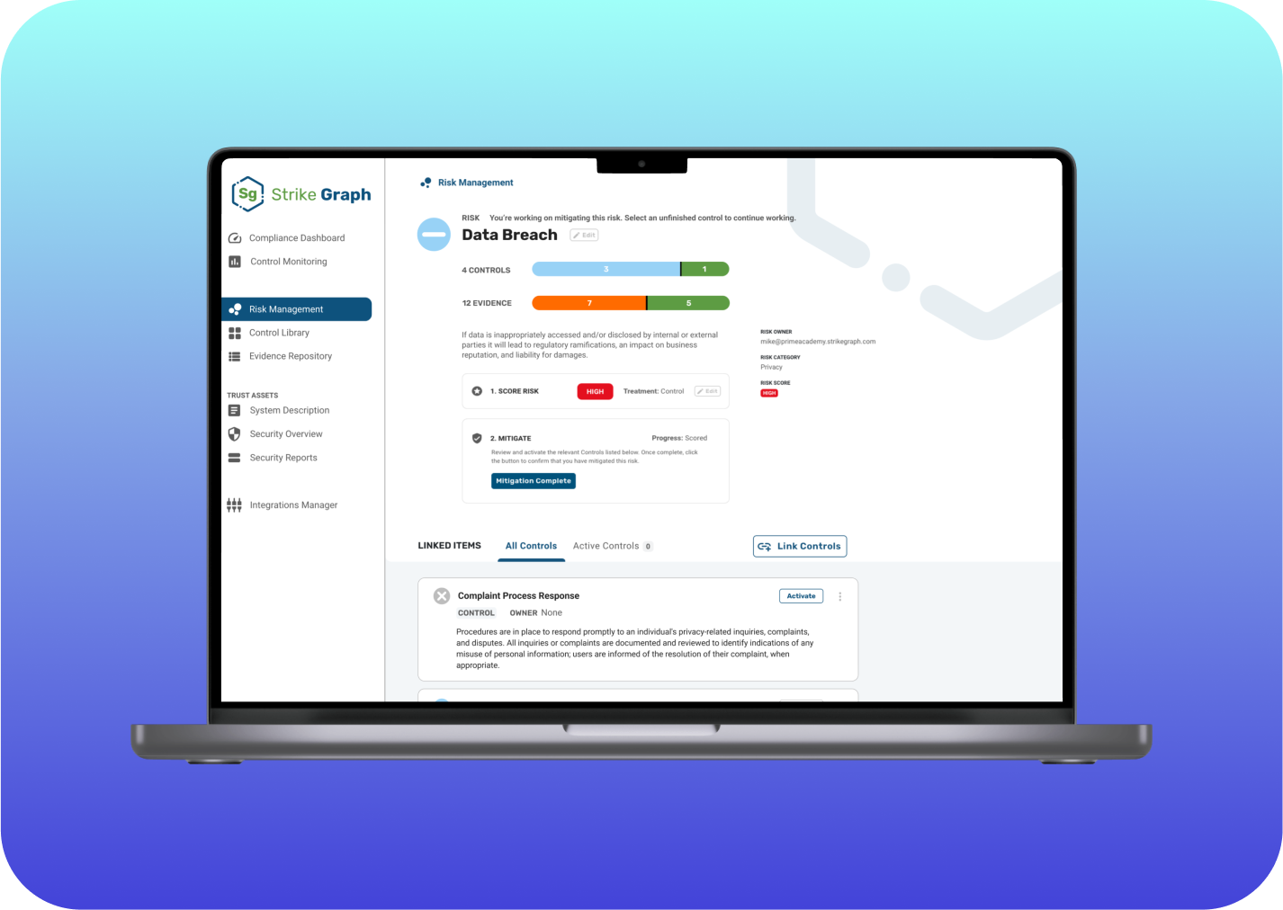
Strike Graph
Overview
✴️ Impact Statement
Strike Graph is a SaaS (Software-as-a-Service) product company that builds tools to help other businesses establish trust with their customers by achieving and maintaining cybersecurity compliance programs. Currently, product onboarding and compliance education exist primarily outside of the app with dedicated customer service reps. Strike Graph would like to reduce the hand-holding required by their Customer Success team to help their users complete their required tasks and understand how to use the product.
I developed a new status design style and built a prototype to improve Strike Graph’s existing web app.
🙎🏼♂️ My Roles
UX Researcher, UX/UI Designer
Pen and paper
Figma
Loom
Zoom
Google Docs
🛠 Tools
📈 Methods
Cognitive walkthrough
Contextual inquiry
User stories
Flow mapping
Wireframing
Prototyping
Virtual walkthrough
🤔 Understanding Compliance
Compliance is confusing. That was my first thought when I started this project. Because we were tasked with making a compliance tool easier to understand, I had to dig in and learn compliance fast. I leveraged my strengths at taking complex information and systems and simplifying them into easy to understand processes.
I approached this problem through three methods:
Onboarding session
Cognitive walkthroughs
Contextual inquiry
My learning started with a demo onboarding session with a customer success manager from Strike Graph. I gained insight into how to use the tool, and the process new users go through when they first sign up for Strike Graph. I also got a high-level understanding of why compliance matters. I found it really helpful to experience the same onboarding that a compliance manager would go through. It gave me a deeper understanding of the problems and put me in the shoes of our target user group.
Onboarding Session
My notes and ideas from the onboarding sessionI next completed a cognitive walkthrough of Strike Graph to better understand key tasks on the web app. Overall, I found that the tasks were straightforward to complete. Some visual indicators were small and unclear, but for the most part the web app passed the cognitive walkthrough. The real insights we gained came from the contextual inquiries, which revealed some major confusions on the web app
Cognitive Walkthrough
Sample page of cognitive walkthroughWe conducted 3 contextual inquiries with Strike Graph users. The goals for our research were to:
Learn how users use Strike Graph
Gain insights on friction points during the user's experience and understand how it gets resolved
Learn more about how the user's environment impacts tasks
Understand the total time spent on key tasks
Understand how frequently the tool is used
Contextual Inquiries
Me and the team during contextual inquiriesI synthesized our research findings into the following themes:
Users are overwhelmed with information and not sure what needs to be done next in their workflow.
Work is split up disparately amongst team members. No one user uses every feature of the product.
Color visibility, inaccessibility, and inconsistency lead to inefficient use of the product.
I constructed user stories and scenarios to support the findings and inform my prototype.
User Stories
As a compliance manager, I want to complete my required compliance tasks efficiently so that my company is prepared for a compliance audit.
As a co-founder of a start-up, I want to establish proper compliance so that I feel secure and confident in growing my company.
Scenarios
You run a mid-size health tech company and have your yearly compliance audit coming up next month. You want to make sure that all of your documents are in order so that your company is compliant with all necessary policies. Because you have a lot on your plate, you want an easy way to know where the information is and what to do next as you go through your work.
Your fintech start-up has just received $20M in venture funding, and you’re ready to build out your product to launch publicly. Since you’ll be storing important user data like banking and credit card information, proper compliance is necessary before you can bring your product to market. You haven’t done much to set up compliance before, and you want to be confident that your company is meeting proper compliance before you launch.
User Stories
😇 Simplifying Compliance
A common theme from our research was that users didn’t understand what to do on a page, so this is where I focused my redesign efforts. I focused my work on my first scenario, and brainstormed ways to improve clarity of information and symbols.
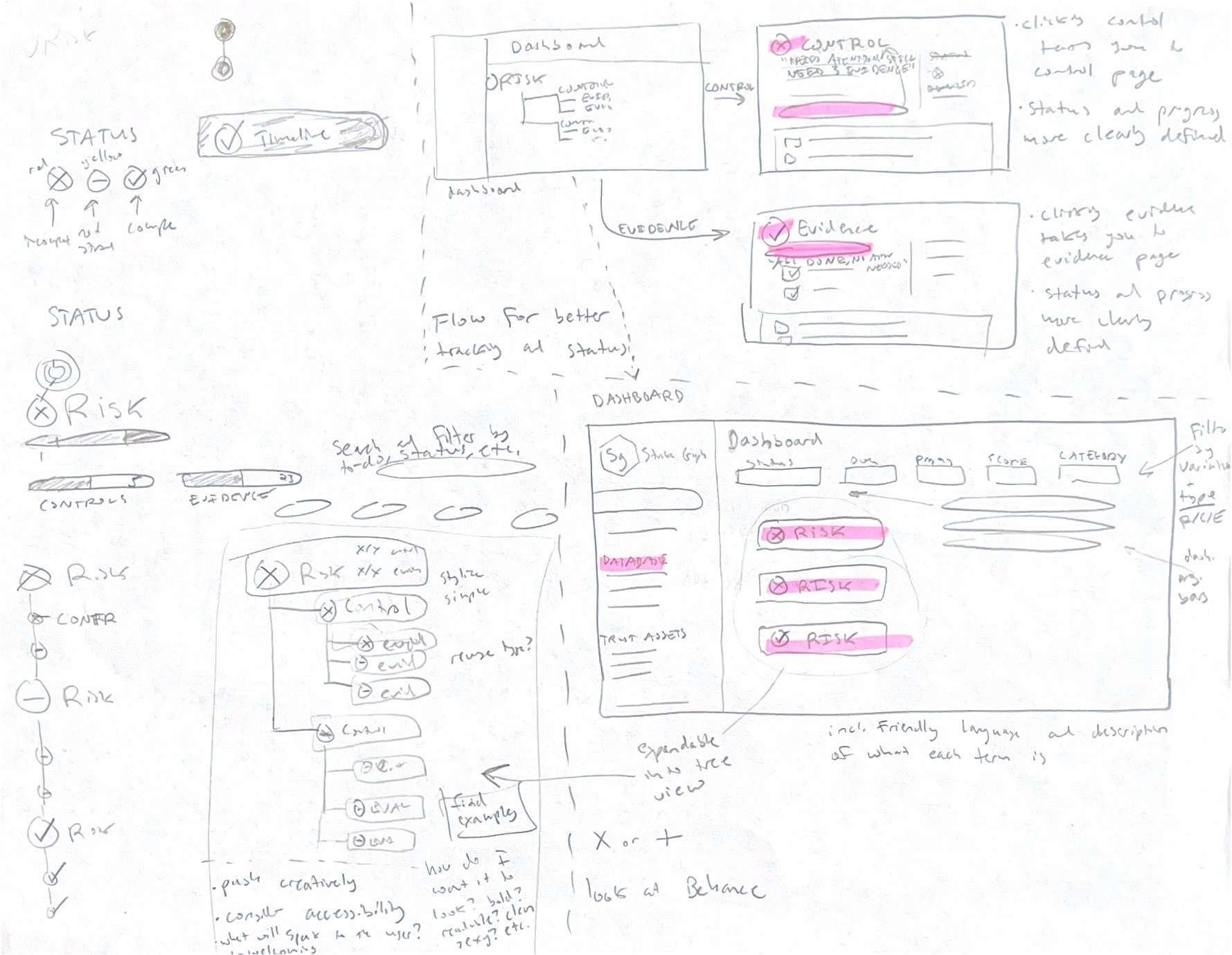
I first broke down the compliance process into smaller pieces so that I understood the flow of information. As I did this, I realized that this would be a helpful way to organize and communicate status of information for users. I ran with this idea in my sketches.
My sketch of the process breakdownMy initial sketches: screen redesigns, new icons, a user journey, and a timeline featureTo make better pages, I needed a new set of icons and colors to communicate the status of key tasks. Our research informed us that the existing red/green status indicator was inaccessible for color blind users. As I went through my design process, it was clear that a new design style for status indicators would address user needs. I developed a new status design style, with focus on symbols, colors, and action-oriented language.
Clearer Status Indication
Colors are consistent across various elements, and hover labels are added to further enhance comprehension.
Each icon is big and bold to improve readability. Icons are defined by color and symbol for accessibility.
New status text indicates what to do on a page. Text is colored to match status symbol for clarity.
The current Strike Graph dashboard provides progress information at a glance, but exists outside of a user’s workflow. The landing pages provide no context for what action needs to be taken. I added large status indicators and action language to each page. This addresses user and client needs by facilitating understanding of the tool and reducing the need for customer success onboarding.
Information at a Glance
Risk Management Screen
Data Breach Screen
Interactive Prototype
View the Figma file for complete annotations.
⏩ Next Steps
My current interactive prototype is ready for a round of usability testing. I would do that next, to understand how well my proposed solutions solve user needs. After conducting the usability tests, I would prioritize the design elements that least resonated with users. With that in mind, I would then iterate on my current designs. Depending on scope and time, I would ideally conduct another round of usability testing before applying these changes across the product.


