Gramercy Cleaners
Overview
✴️ Impact Statement
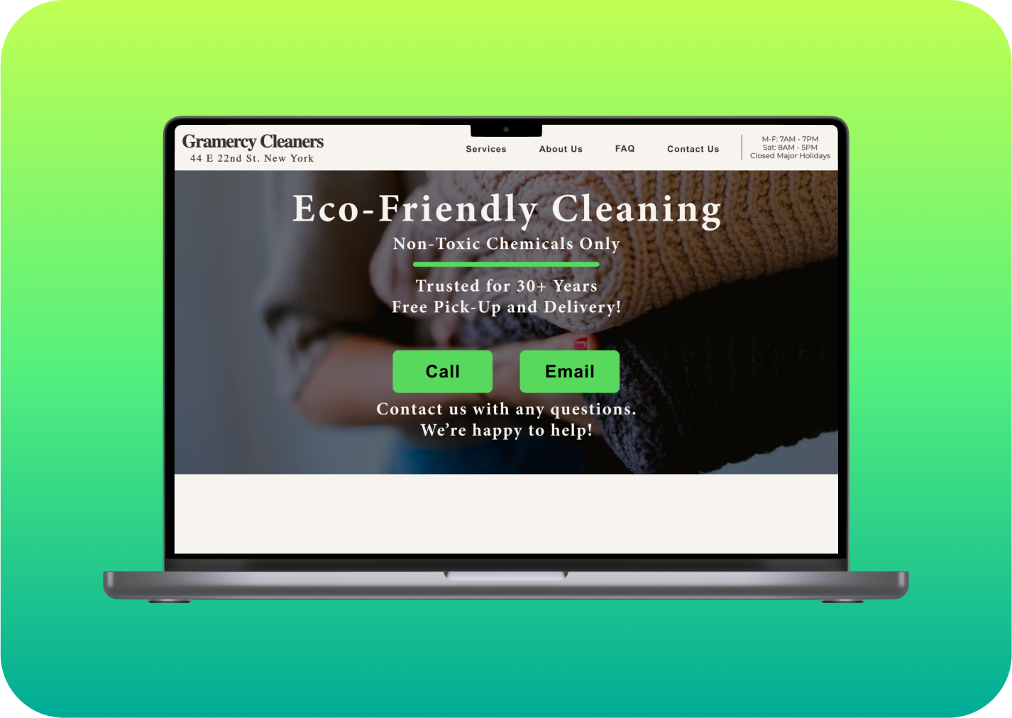
Gramercy Cleaners is a cleaning service that prides itself in delivering eco-friendly laundry and tailoring services. Gramercy Cleaners should have a website that reflects their values and high quality of service. While the current website is warm and welcoming, it is missing key information and is confusing to users. Through user testing, evaluation, and synthesis, we determined several recommendations to improve Gramercy Cleaners’ website.
UX Researcher, UX Designer
🙎🏼♂️ My Roles
🛠 Tools
📈 Methods
Pen and paper
Figma
Keynote
Google Docs
Zoom
Heuristic analysis
Usability tests
Affinity diagram
Wireframes
Mock-ups
🔭 Establishing Goals
Gramercy Cleaners provided a client brief that detailed their business goals, their user goals, and their site goals. When my group started making sense of these things, our thoughts were really scattered and we were jumping all over the place. I adapted my strategic process to best fit with the group. I slowed down and listened to the team, which resulted in a much deeper understanding of the client problem and strengthened our team.
We established project goals based on the client intake:
To better understand how easy or difficult it is for users to find information about the business through existing hierarchy and information architecture.
Gain insights about user flows.
Identify pain points and problem areas around user and business interactions.
Identify user perceptions of the business.
I conducted a heuristic analysis of the website, testing it against Jakob Nielsen’s 10 Usability Heuristics. I found major violations of flexibility and efficiency of use, and consistency and standards. Many parts of the website were not standardized such as the contact form and the “About Us” page. Additionally, key information was missing from the website such as drop-off/pick-up times.
Heuristic Analysis
Informed by my heuristic analysis results, I hypothesized several areas for improvement on the site:
Add price calculator for available services (reduce cognitive load)
Build out contact form on the website, with usual sections for subject and body
Realign content to appropriate pages
Improve homepage language to clearly define the services available, without needing to click “services” right away (reduce friction)
Group products by likeness for easier navigation (reduce cognitive load)
I was really curious to see what issues users would notice when using the site naturally. We found several issues when going through the website with a fine tooth comb, but I didn’t know if users would find the same issues or pick up on different problem areas on the site.
Initial Hypotheses
🧱 Building a Plan
After each conducting our own heuristic analysis, our team combined our insights and modified our initial task list. We then built out scenarios from the tasks and constructed our evaluation plan. In addition to the scenarios, participants were also asked to rate their confidence in the information on the site, the site’s ease of use, the trustworthiness of Gramercy Cleaners, and the likeliness that they would use Gramercy Cleaners’ services.
Tasks
Tell me what services are available?
Tell me when services are available?
Tell me where they are located?
Tell me how much 50lbs of laundry costs?
How much would it cost to dry clean a week’s worth of clothes? What are the values of the company?
Contact them (email/call).
You've decided you want to use Gramercy for your laundry services.
a.) So let’s say you need to inquire about services and want to understand what they offer. How would you do this?
b.) Now you want to place an order. How would you do this
?
c.) And finally, you want to get updates or ask questions about an existing order. How would you do this?
Sample Scenario
🤔 Learning from Users
Testing is Better in a Team
We conducted usability tests over Zoom with 12 participants who met relevant criteria to the study. Each session was roughly 30-min. I conducted 2 individual usability tests and 5 group usability tests. In the group usability tests, I moderated 1 test, was the technical lead for 1 test, and observed/took notes for 3 tests.
In this process I learned how to run effective usability tests. My first individual test was really hard! Running tech, moderating the test, and taking notes all at the same time was overwhelming at first. My first participant also gave very detailed answers, so I had to manage the clock carefully. While my next usability tests went much smoother, what really changed the game was getting to run tests with a team.
We delegated roles for the tests, which resulted in better insights and calmer tests. Our team supported and built each other up during the tests which also increased our confidence. When possible, having a team to support each other in our work is so much better than working alone.
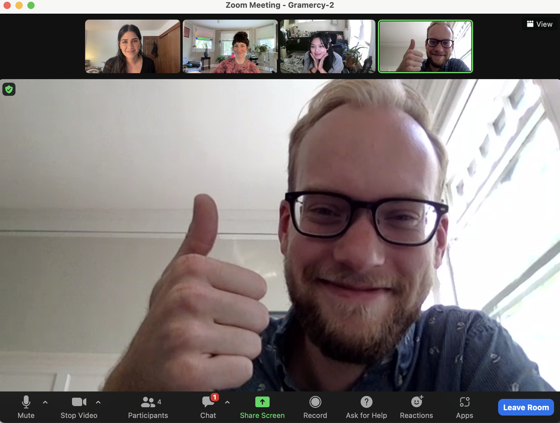
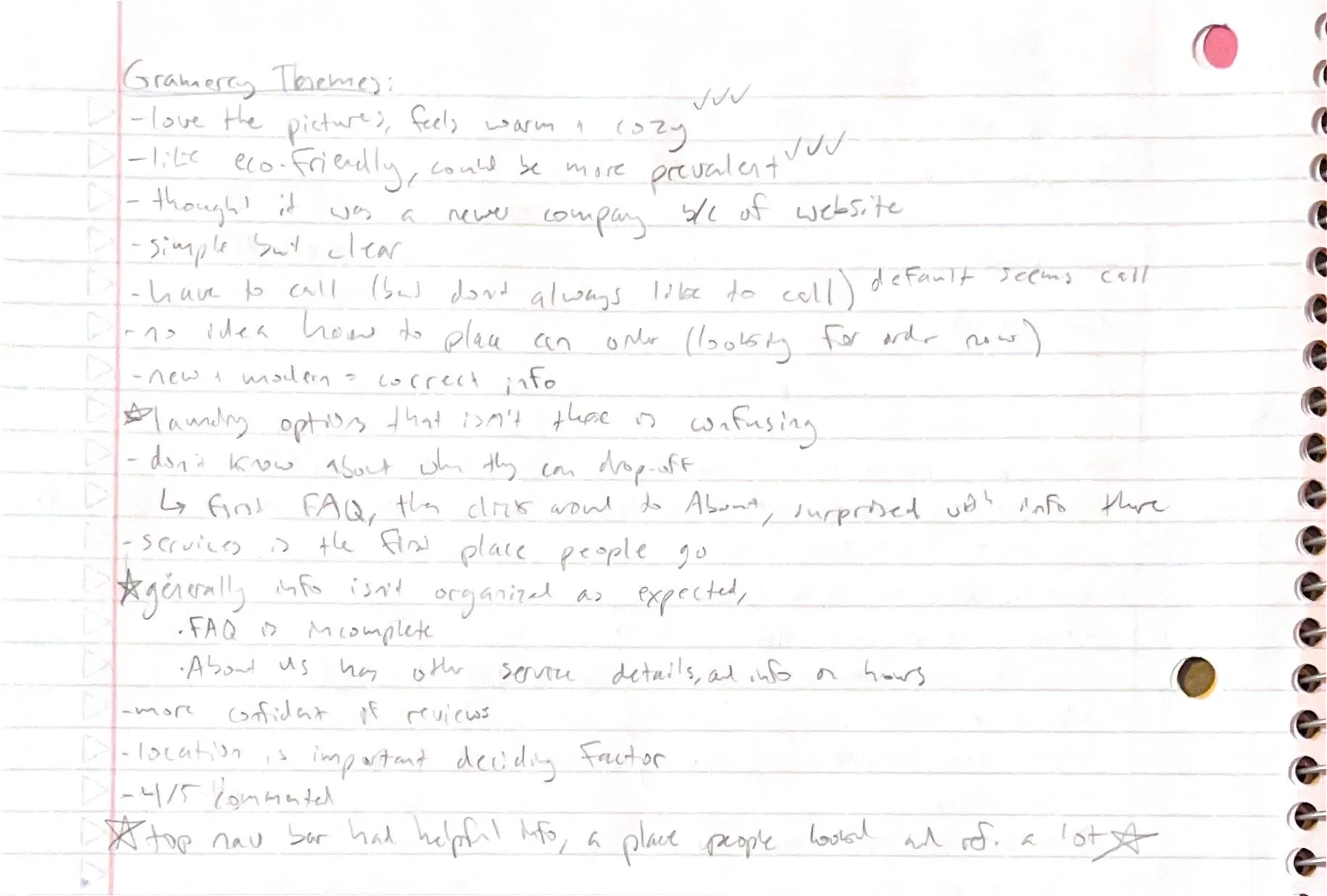
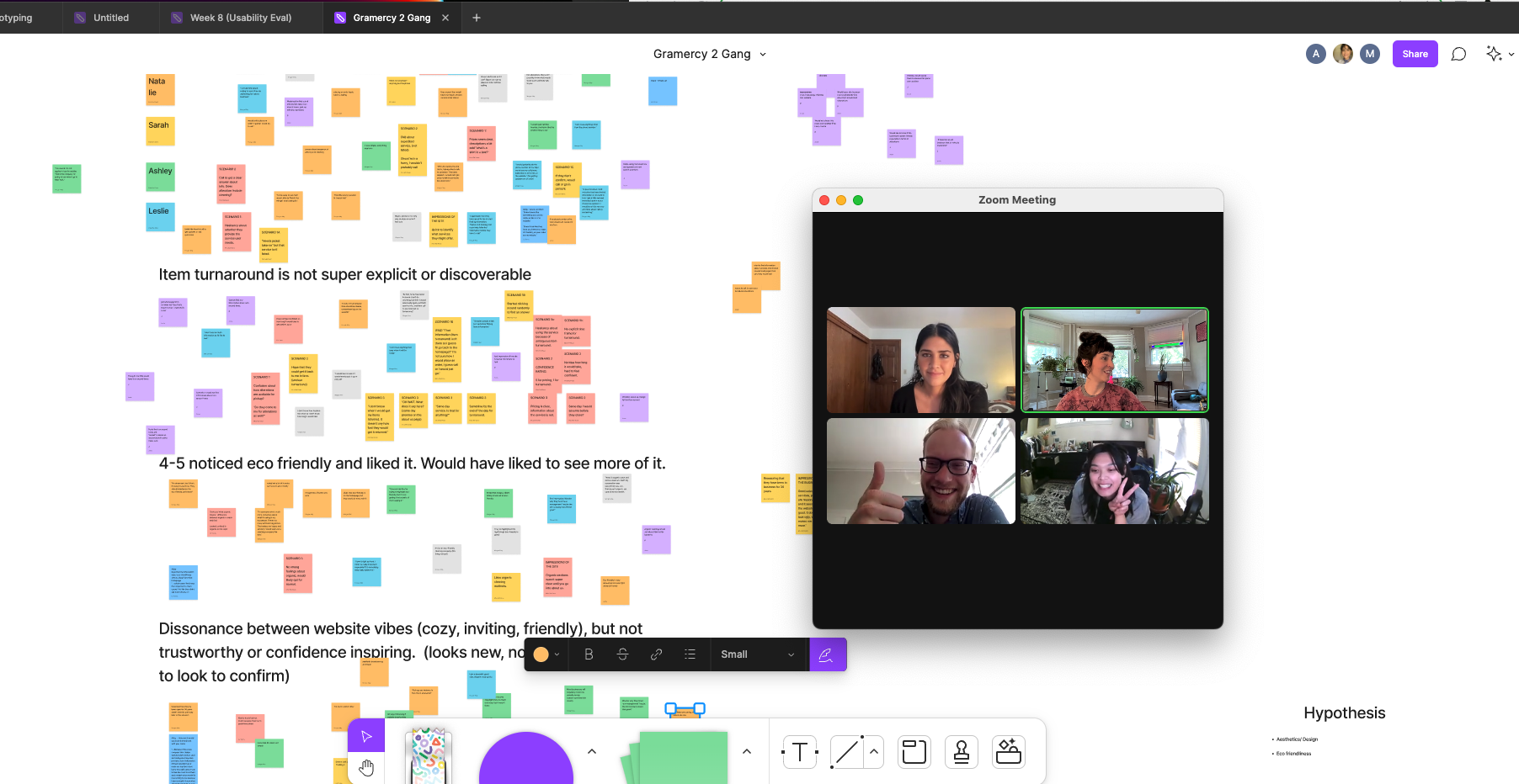
Me and the team after finishing our usability testsOur team debriefed to discuss initial findings and develop some themes from the usability tests. Those themes were the foundation for our affinity mapping. We organized our observations and quotes from all 12 participants in stickies in a Figjam board. We then synthesized the data through affinity mapping, and tweaked the themes as we went through the process.
Analyzing Data
My initial theme notesOur team affinity mapping🔍 Findings and Recommendations
Our final client deliverable was a Findings and Recommendations Report. The key findings I identified from our analysis were:
Key Information is missing
Users resort to callings
Users lack confidence in business
Eco-friendly information is noticed
Website is cozy and inviting
For each finding, I provided several recommendations and created mock-ups to support my recommendations. Below are some examples of finding and recommendation pages from my report.
Mock-Ups
These are the mock-ups I created (informed by my research) to support my recommendations.


